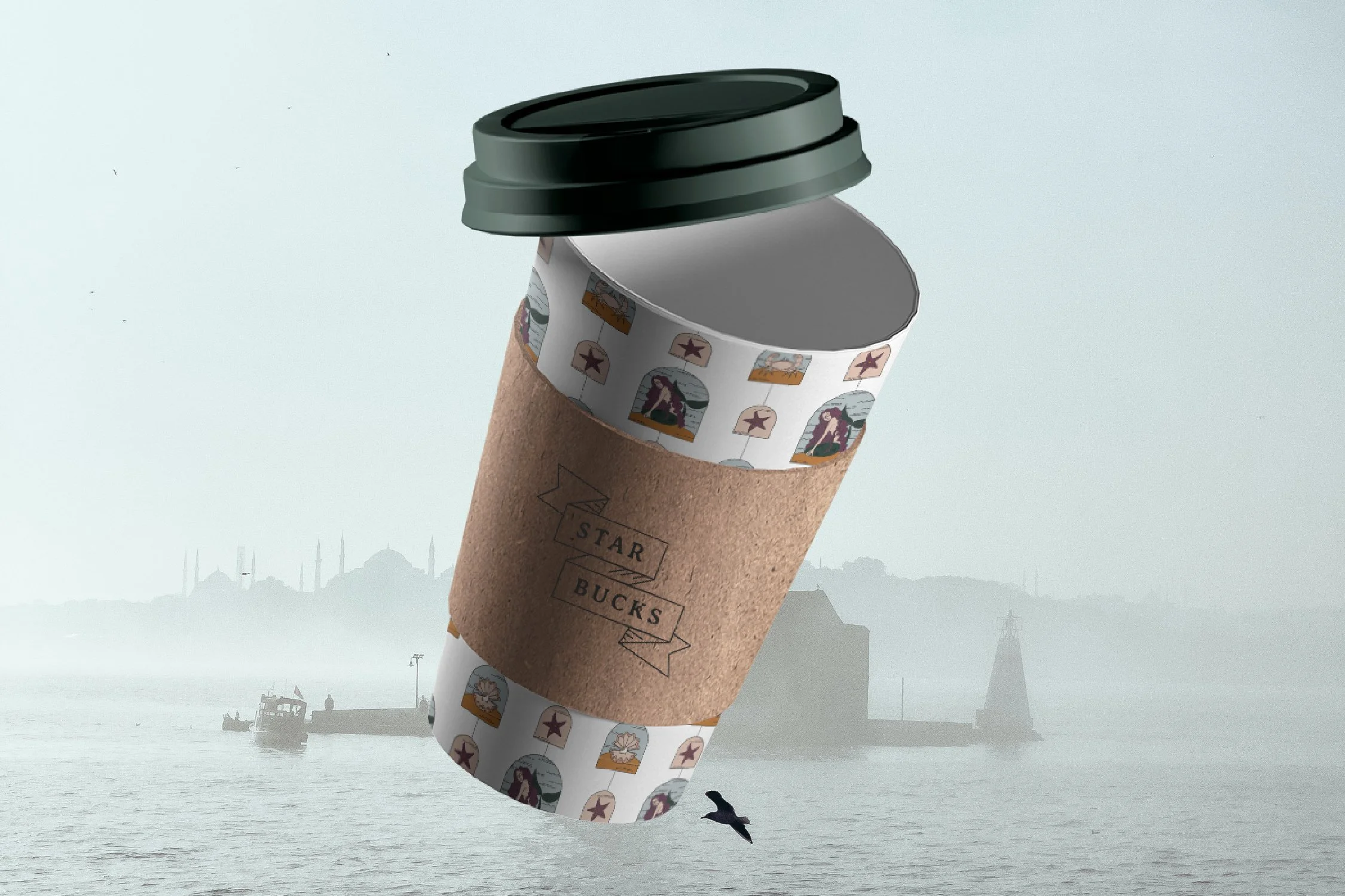
Starbucks, a coffee rebrand.
I was initially nervous about tackling this rebrand passion project, but I ended up having a blast revamping this classic, universally-recognized brand identity design. I wanted to stay true to the nautical elements to stay true to Starbucks’ roots, and I chose to continue with the green they are recognized by, just updating the tone to make the brand feel more mysterious and mature.
Aside from rebranding such a well-known and loved brand while staying true to its origins, another challenge was creating a design that was illustrative without it feeling overwhelming, too detailed, or childish. I decided to use thin lines in my illustrations to keep them looking light, to use muted colours to keep the brand mature, and to incorporate lots of white space to keep the designs from looking messy and busy. The result is a minimal feeling while still being detailed.


