


Oh Mochi!, a fun & vibrant mochi brand.
As a lover of mochi, I couldn’t resist playing this brand identity design up to the max! I wanted it to be fun and illustrative with pops of colour. Because mochi is originally from Japan, I also wanted to give Japanese culture a nod without being too blatant. Here’s how I came up with my brand identity design!
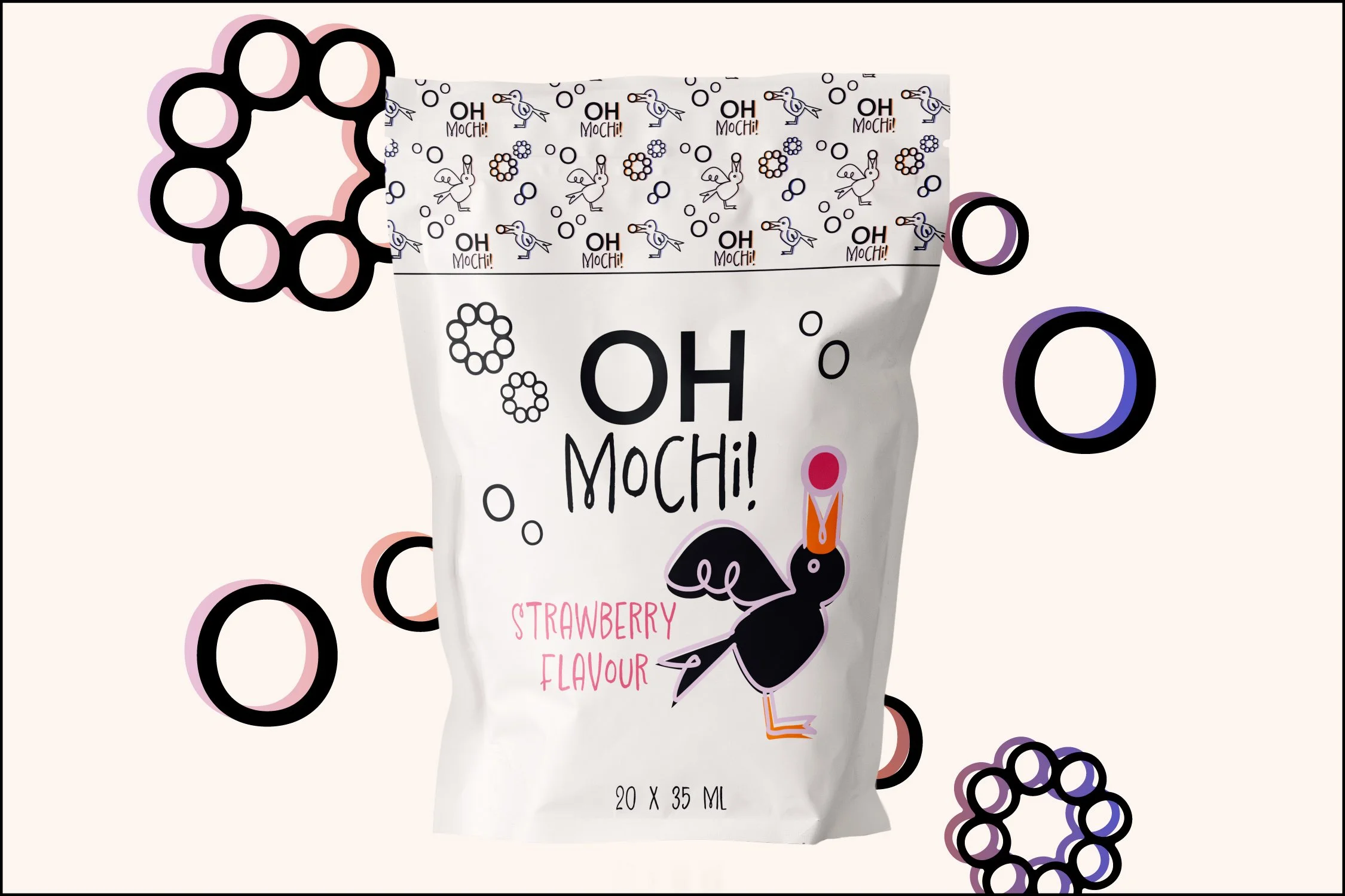
First, I chose the font for the logo and tweaked it for the primary and secondary logos. using the “O” and “M” from the name, I realized they could be placed together to look like a beak eating a mochi, and that’s when I decided to illustrate a crow commonly found in Japan using a cute doodle look that matches the logo. I then reused the “O” to create floating mochis and mochi donuts.
Paired with blotches and gradients of colour, this brand identity design screams a fun time for people of all ages!
