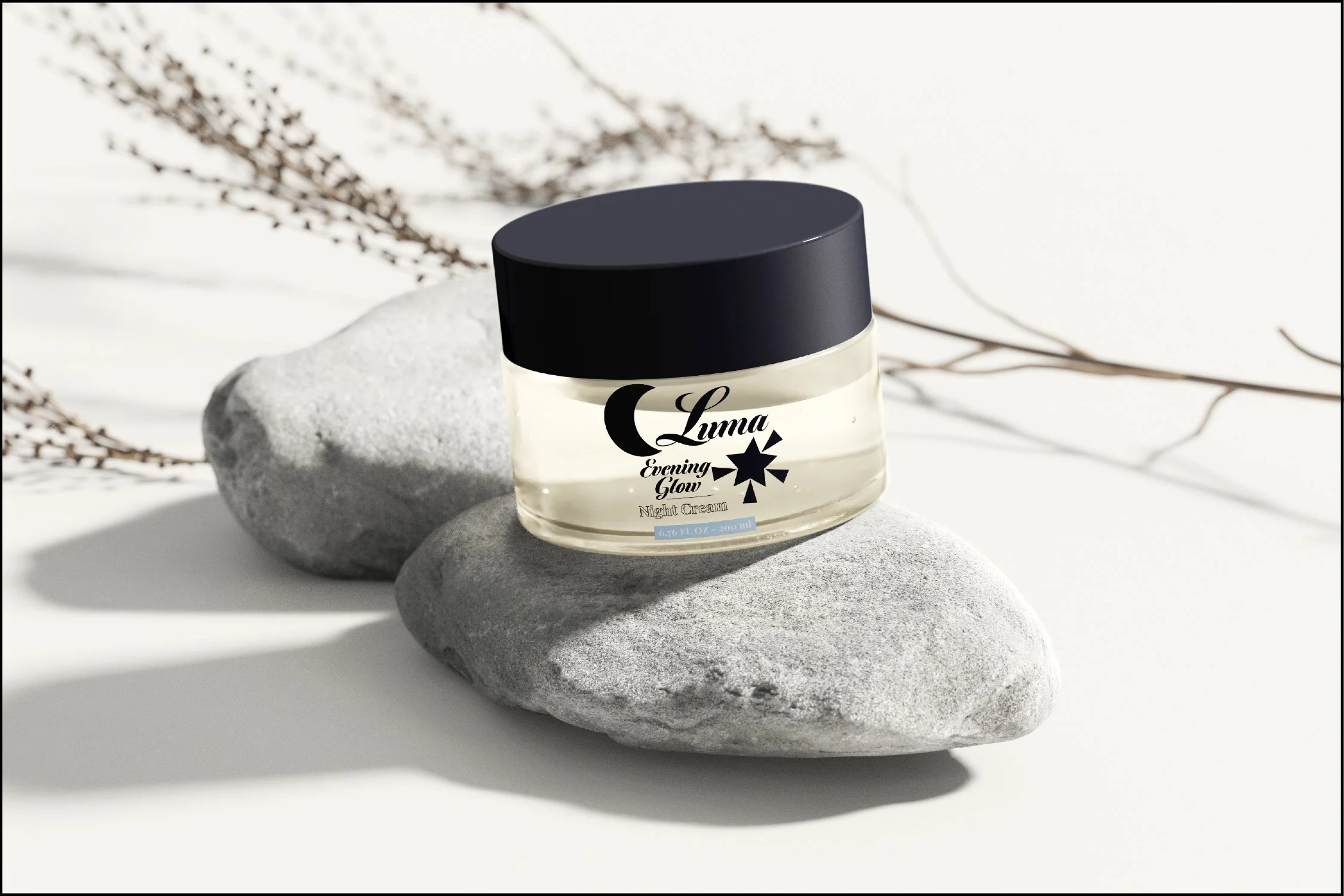
Luma, a youthful skincare brand.
This was a passion project where I made up the company and created the branding the way I envisioned. I wanted to work on an identity design for a skincare brand—I remember being a teen looking for a facewash that could get rid of my most recent zit!—and I wanted to have it look mature and elevated, yet still bubbly and fun. This was the result.
I think the greatest challenge I had to overcome for this project was figuring out how to balance an elevated and youthful aesthetic. It needed to look approachable enough for youth to feel it’s created for them and within their budget, yet classy enough that it also says “This is a great quality product.” I achieved this by creating simple shapes, using more mature colours, and finding a cursive, rounded font to use for the logo.


